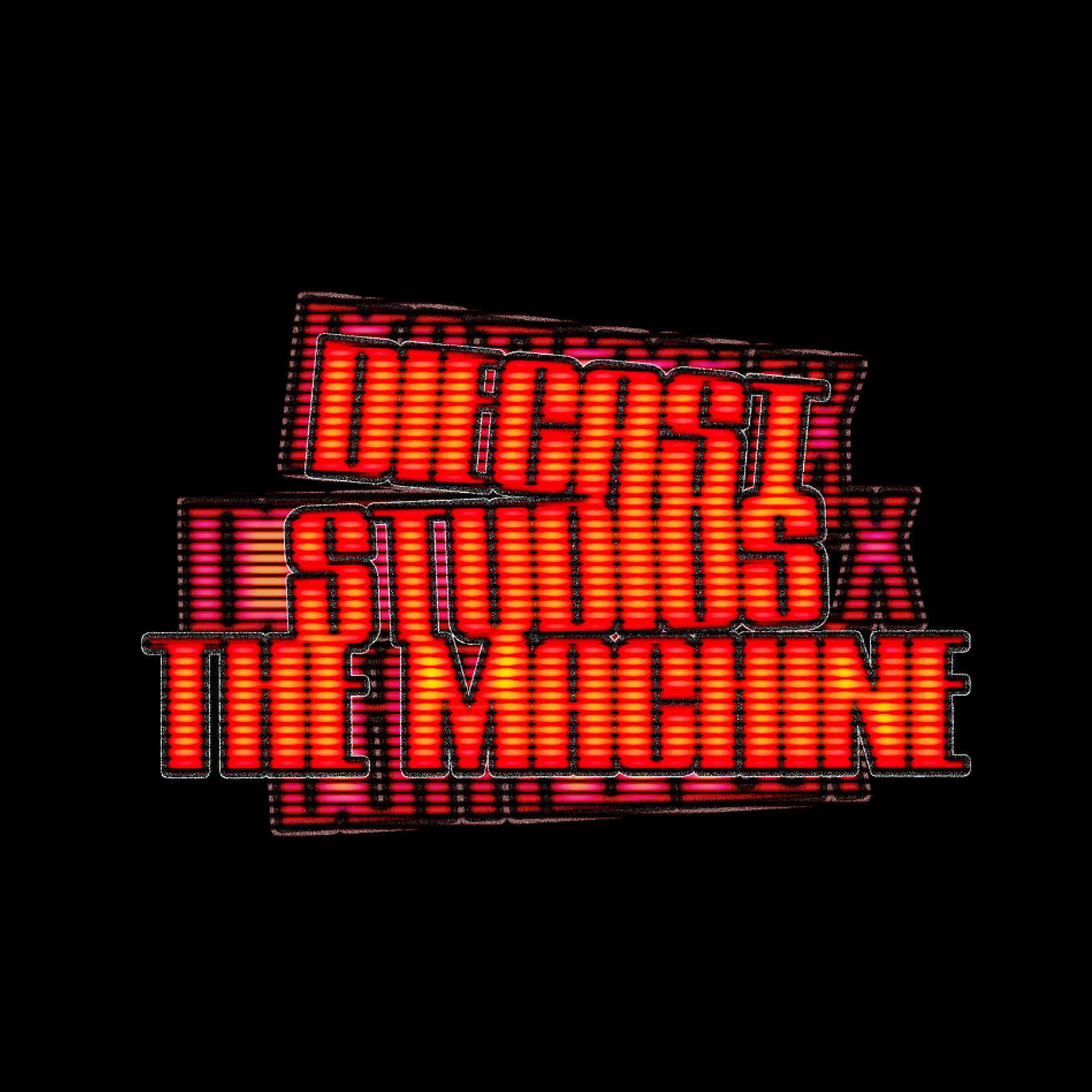
NINE LIVES VISUALS
DESIGN, DIRECTION, CURATION, SOLUTIONS.
A relentless curiosity for innovation and a passion for design are what drive me forward.
To me, design isn’t just about making things visually appealing—it’s about solving challenges so others don’t have to. It’s about creating solutions that are durable, efficient, and meaningful.
This approach is what transforms a good product, service, or idea into an exceptional one.
To me, design isn’t just about making things visually appealing—it’s about solving challenges so others don’t have to. It’s about creating solutions that are durable, efficient, and meaningful.
This approach is what transforms a good product, service, or idea into an exceptional one.
SELECTED WORKS - SELECTED WORKS - SELECTED WORKS -
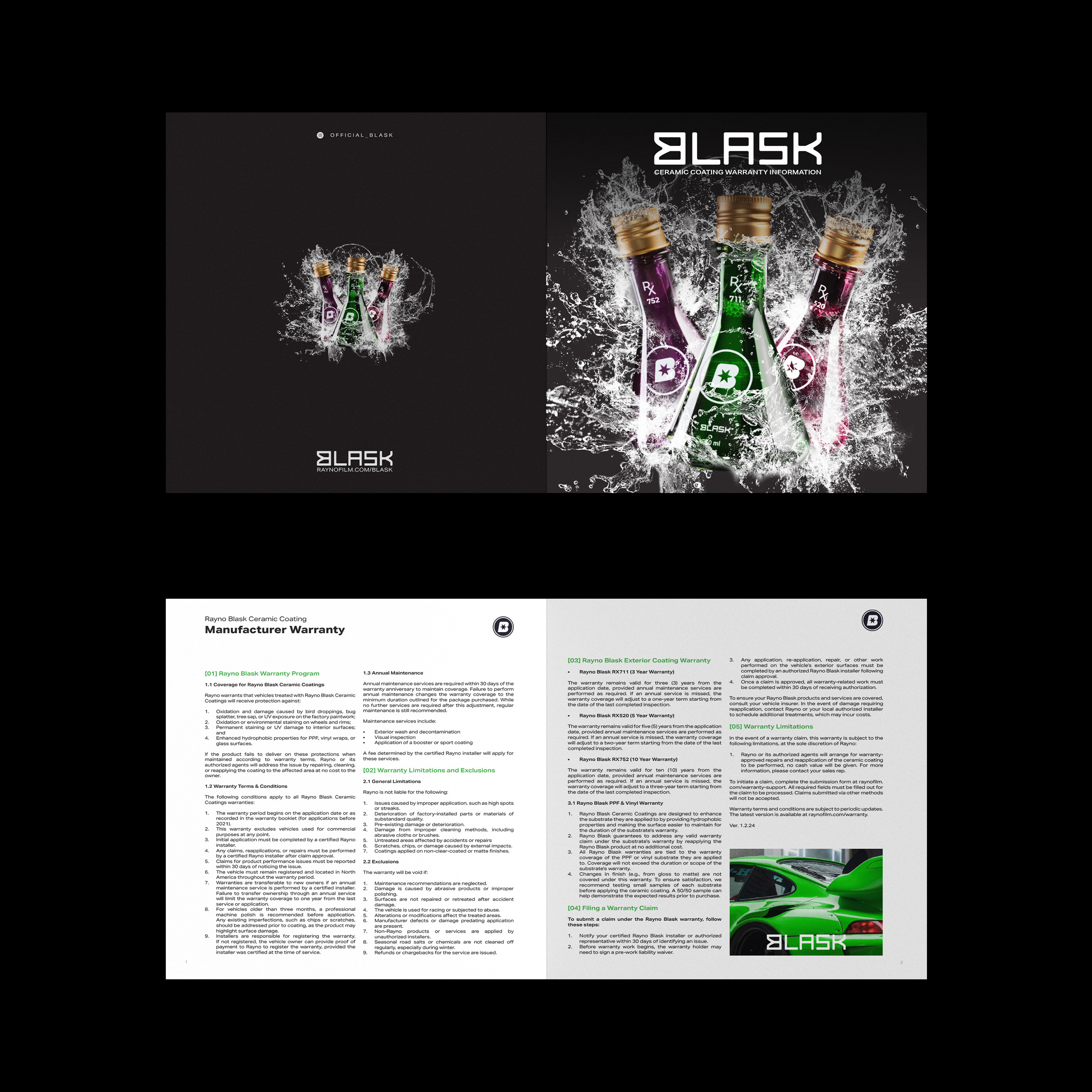
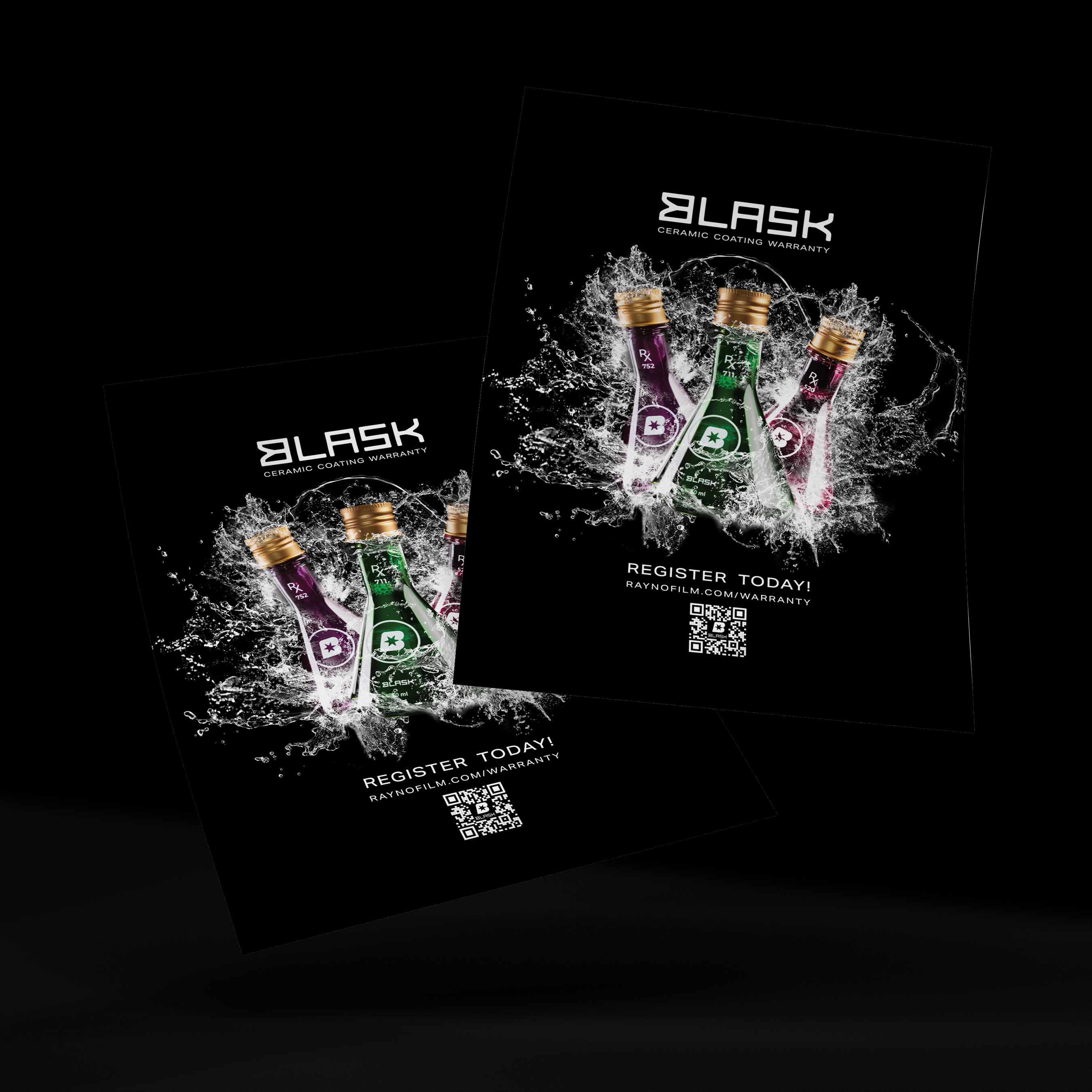
Blask Ceramic Coating
Contribution:
Art Direction
Layout Design
Photography
Production
Deliverables:
Warranty Manual
Informational Banner
Quick Scan Sheet
Contribution:
Art Direction
Layout Design
Photography
Production
Deliverables:
Warranty Manual
Informational Banner
Quick Scan Sheet
The Problem
Customers interested in Blask Ceramic Coatings often had concerns about long-term protection and warranty coverage. Existing marketing materials lacked clarity, leaving potential buyers unsure about what was covered, for how long, and why this product stood out. The absence of a well-designed brochure / marketing material meant lost opportunities to build trust and convert leads.
The Solution
I designed a sleek, informative two-page brochure that not only explains the warranty details in an engaging way but also enhances brand perception through custom graphics, a strategic layout, and clear copywriting. The design approach focused on high-contrast visuals that reflect the premium nature of Blask Ceramic Coatings, infographics and icons to break down complex warranty terms, and a structured layout that flows naturally from features to benefits to action steps.
The Result
The new brochure and marketing material system gives sales teams a powerful tool to educate customers and build confidence in the product. The clear, professional design helps streamline the sales process, reducing customer hesitation and reinforcing brand credibility.

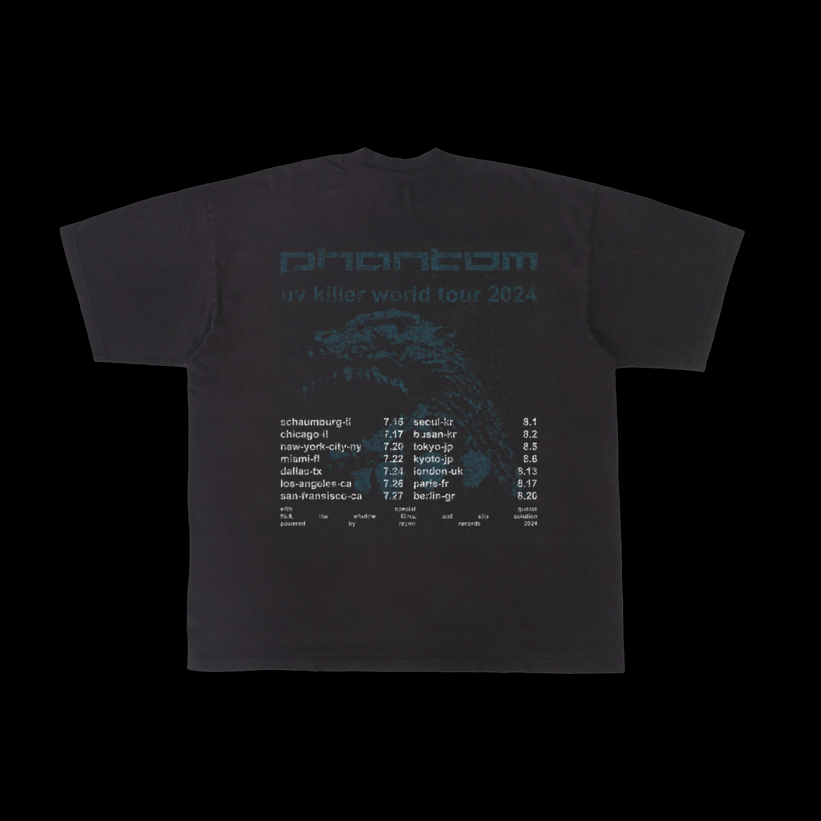
Rayno Window Film
Contribution:
Art Direction
Graphic Design
Production
Deliverables:
Themed Merchandise Release
Merchandise Design
Contribution:
Art Direction
Graphic Design
Production
Deliverables:
Themed Merchandise Release
Merchandise Design
The Problem
Rayno wanted to expand its brand presence beyond automotive products by offering high-quality merchandise and apparel. However, their existing selection lacked fresh, modern designs that truly resonated with their audience. To strengthen customer engagement and brand loyalty, they needed apparel that seamlessly blended style with the brand’s identity.
The Solution
I designed a series of custom t-shirts for Rayno, incorporating bold graphics, sleek typography, and a color palette that aligns with the brand’s aesthetic. Each design was carefully crafted to reflect Rayno’s high-performance reputation while ensuring wearability for both automotive enthusiasts and casual fans. From minimalist logo placements to dynamic graphic elements, every piece was created with a balance of brand recognition and streetwear appeal.
The Result
The new apparel collection gave Rayno a fresh way to connect with its audience, increasing brand visibility beyond automotive products. The modern, stylish designs helped generate excitement among customers, leading to higher engagement and merchandise sales. By translating the brand’s identity into wearable fashion, the collection reinforced Rayno’s presence in both the automotive and lifestyle markets.


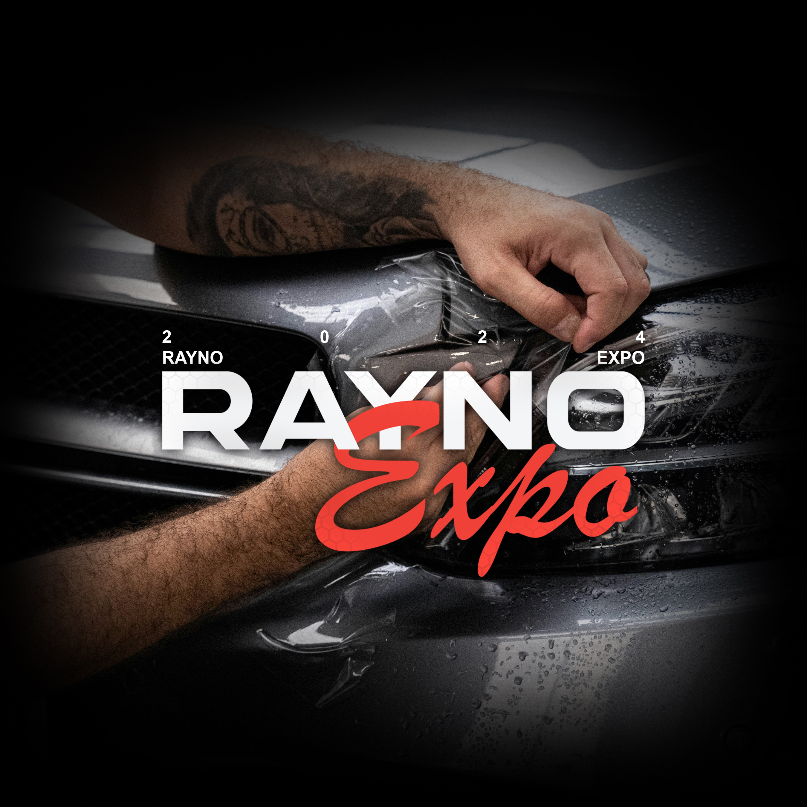
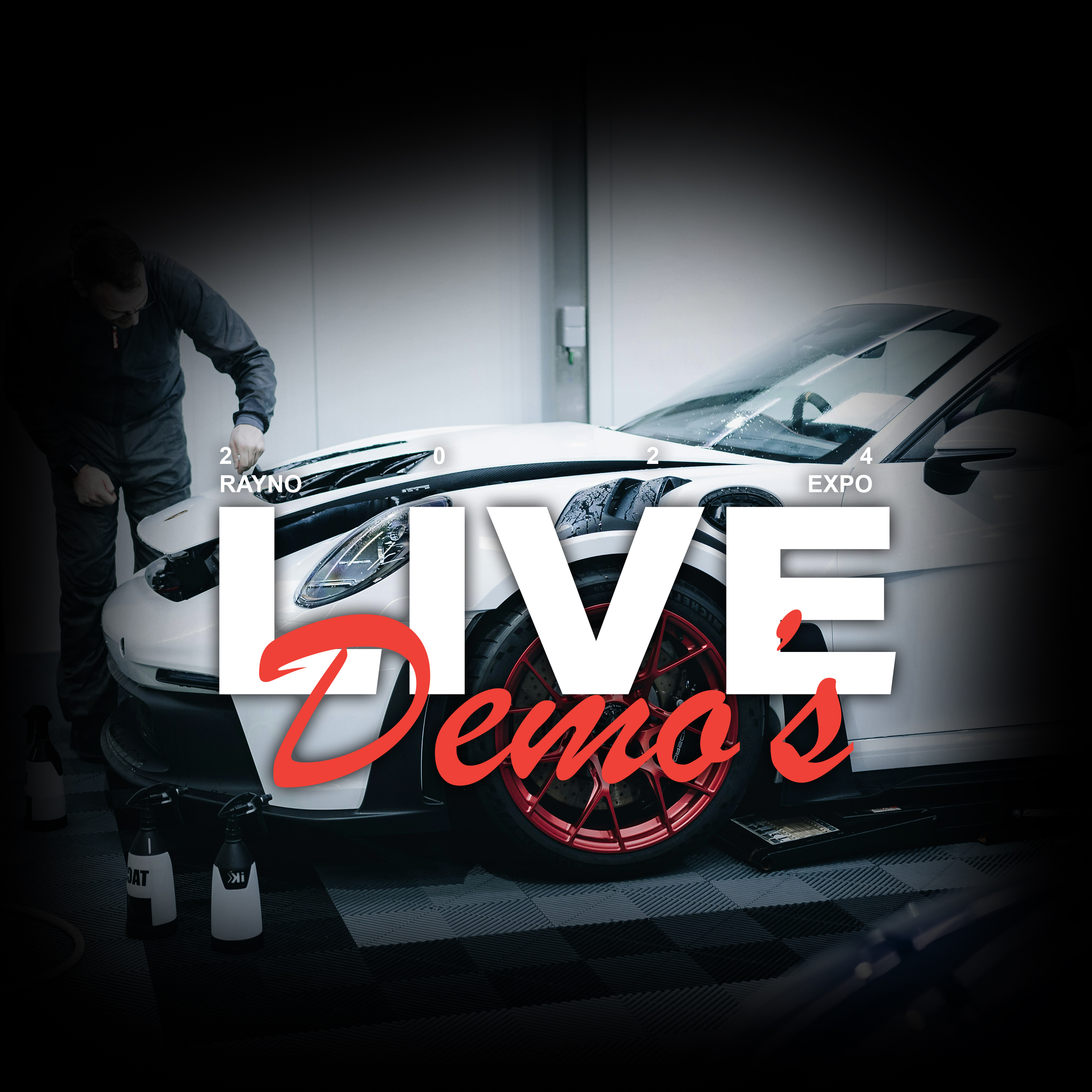
Rayno Window Film
Contribution:
Art Direction
Event Coordination & Planning
Photography
Production
Deliverables:
Social Media Planning
Digital Media Assets
Physical Media
Sales Plan
Vendor Coordination
Collaborator Coordination
Contribution:
Art Direction
Event Coordination & Planning
Photography
Production
Deliverables:
Social Media Planning
Digital Media Assets
Physical Media
Sales Plan
Vendor Coordination
Collaborator Coordination
The Problem
Rayno needed a high-end, exclusive branding experience for Rayno Expo, its premier invite-only dealer event. As a leader in automotive innovation, Rayno wanted to create an event that reflected its cutting-edge technology, premium product lineup, and strong industry relationships. The challenge was to design a cohesive visual identity that elevated the exclusivity of the event, engaged attendees, and reinforced Rayno’s reputation as a top-tier brand in the automotive space.
The Solution
I developed a sleek, modern branding approach for Rayno Expo, ensuring that every touchpoint of the event—from invitations to signage to digital assets—reflected sophistication and exclusivity. The visual identity featured a refined color palette, sharp typography, and clean, futuristic design elements that aligned with Rayno’s brand ethos. High-end printed invitations set the tone for the event, while on-site materials such as banners, stage backdrops, and presentation decks maintained a polished and immersive experience. Custom-designed event swag, including branded merchandise and VIP badges, enhanced the premium feel and made attendees feel like part of an elite circle.
The Result
Rayno Expo became more than just a dealer event—it was an experience that reinforced loyalty and excitement among Rayno’s top partners. The cohesive, high-end design elevated the brand’s prestige, creating a sense of exclusivity and importance around the event. Attendees left with a stronger connection to Rayno, a deeper understanding of its product innovations, and a memorable brand experience that set the standard for future dealer events.


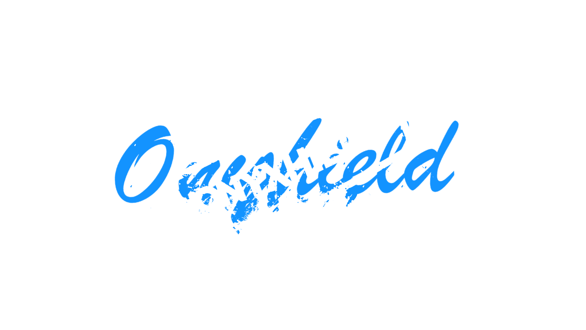
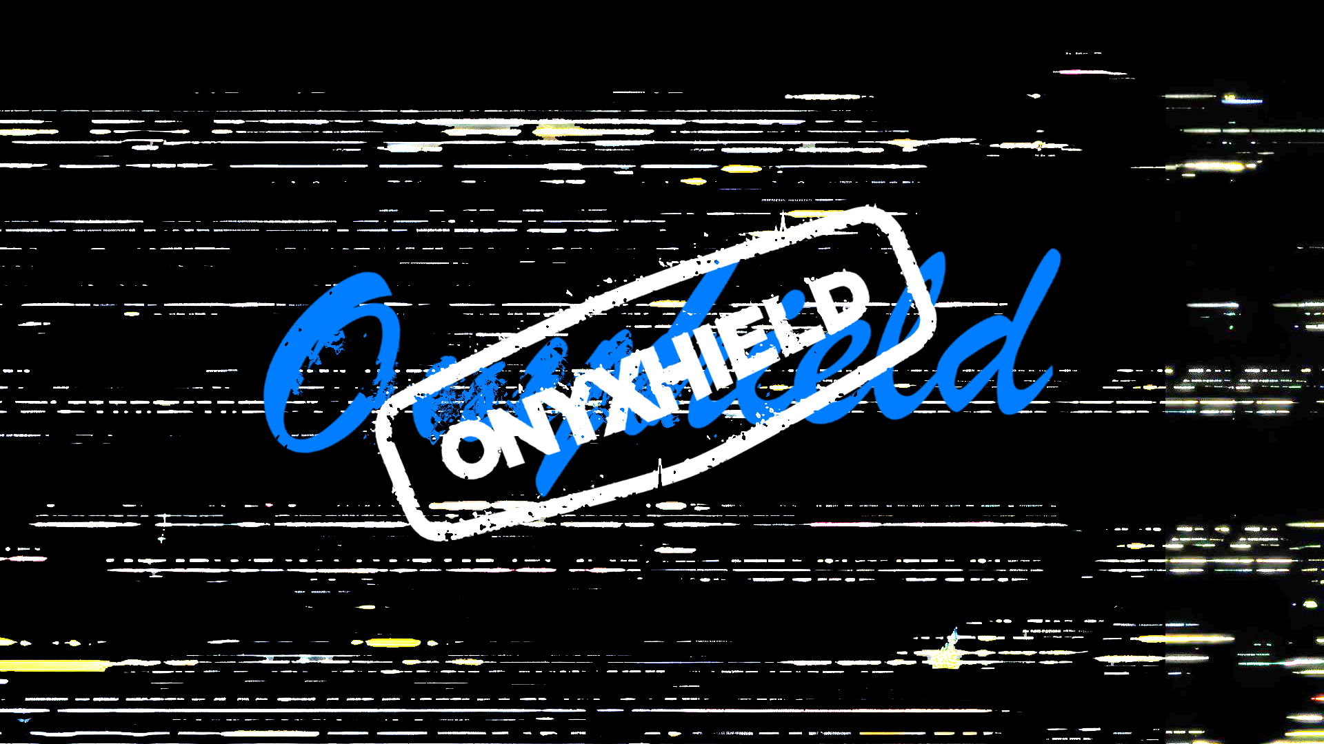
Onyxhield PPF
Contribution:
Motion Graphics
Video Editing
Color Correction
Deliverables:
Short-Form Content
Engaging Video Edit
End User Engage
Contribution:
Motion Graphics
Video Editing
Color Correction
Deliverables:
Short-Form Content
Engaging Video Edit
End User Engage
The Problem
Onyxhield needed a high-impact promotional video to showcase its premium Paint Protection Film in a way that felt as sleek and cutting-edge as the product itself. The challenge was to create a visually engaging video that not only highlighted the film’s durability and performance but also resonated with car enthusiasts and professionals in the automotive industry. Without a compelling visual story, potential customers might overlook the true value of Onyxhield’s advanced protection technology.
The Solution
I crafted a dynamic promotional video that blends cinematic visuals, high-energy motion graphics, and clear, impactful messaging. Every shot was carefully composed to emphasize the precision, clarity, and strength of Onyxhield PPF. The sleek editing style, paired with engaging transitions and close-up details of the product in action, reinforces the film’s premium quality. The final product is a bold, polished, and visually striking piece that positions Onyxhield as the go-to choice for automotive protection.
The Result
The promotional video effectively elevates the brand’s presence, drawing in more interest from both customers and dealers. It delivers a compelling visual narrative that communicates Onyxhield’s superior protection in a matter of seconds. By combining stunning visuals with strategic storytelling, the video helps drive engagement, boost brand credibility, and solidify Onyxhield’s reputation in the competitive PPF market.
Watch the full video here: https://youtu.be/0OhBtwyyCio


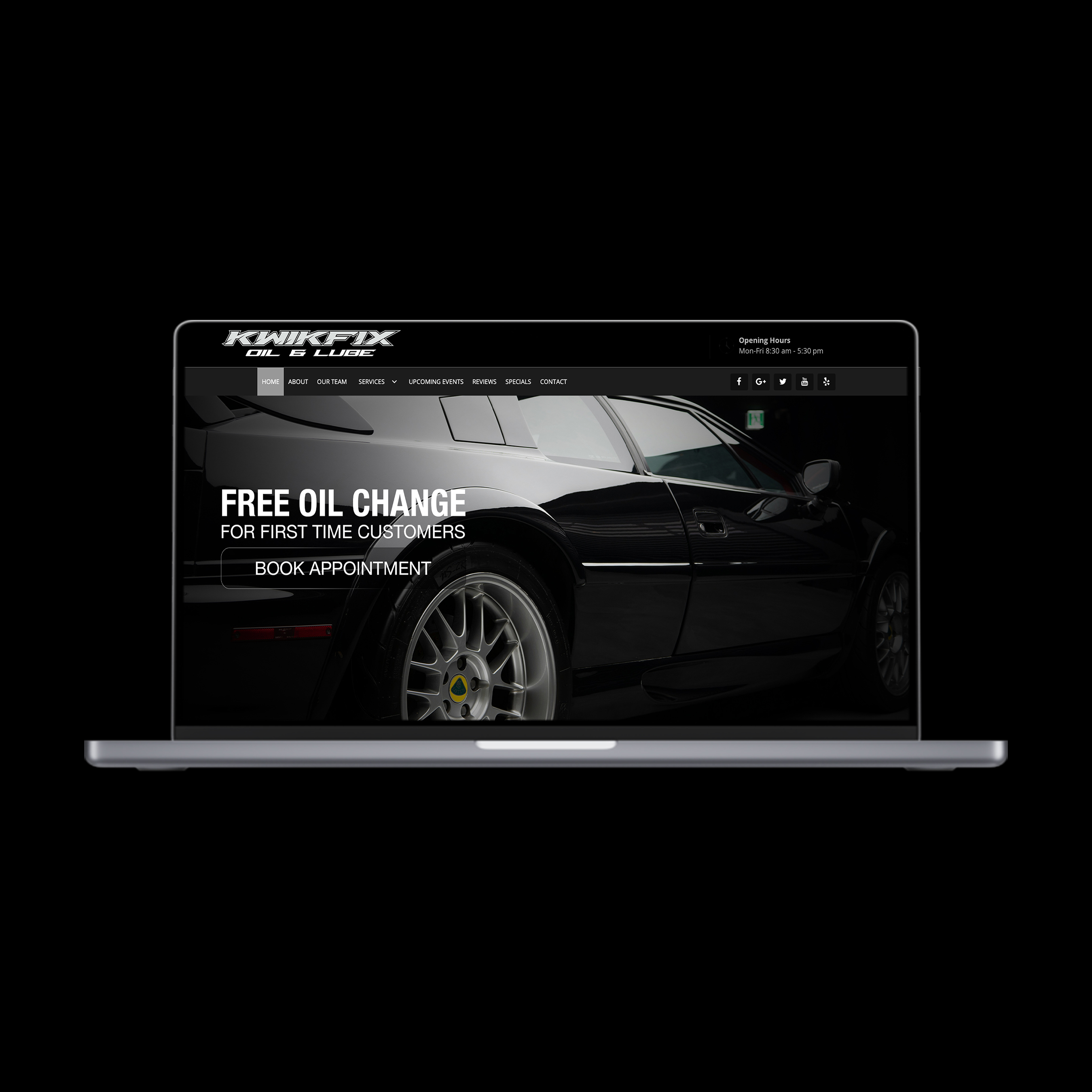
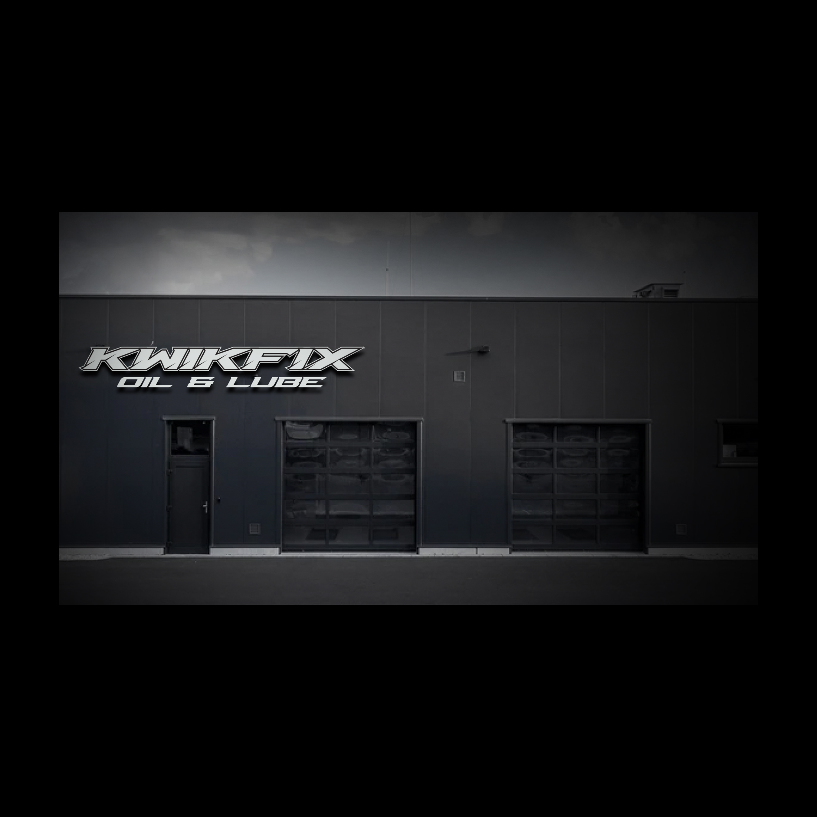
KwikFix Oil and Lube
Contribution:
Art Direction
Layout Design
Photography
Branding
Logo Design
Deliverables:
Full Branding
Brand Ethos
Signage Design
Marketing Materials
Website Refresh
Social Media Curation
Contribution:
Art Direction
Layout Design
Photography
Branding
Logo Design
Deliverables:
Full Branding
Brand Ethos
Signage Design
Marketing Materials
Website Refresh
Social Media Curation
The Problem
Kwikfix Oil and Lube, an automotive repair shop, needed a strong visual identity to stand out in a competitive market. Their old branding and storefront design didn’t reflect their core value of speedy service or their commitment to providing high-quality, efficient auto repairs. The challenge was to revamp the entire aesthetic to emphasize the "quick" nature of their services while maintaining a professional, trustworthy appearance.
The Solution
I redesigned Kwikfix’s storefront and overall aesthetic to create a cohesive, modern look that communicates speed and efficiency. The new logo was developed with bold, dynamic typography and streamlined iconography to reinforce the idea of quick, reliable service. The storefront design was updated with sleek, minimalist color systems and eye-catching signage to attract attention and make a strong first impression. Inside, the visual identity extended to the customer experience, creating an environment that feels both fast-paced and professional. From business cards to digital branding, every touchpoint was designed to consistently convey Kwikfix’s commitment to efficiency.
The Result
The redesign led to a noticeable increase in foot traffic and customer retention, as the new branding clearly communicated the speed and reliability of Kwikfix Oil and Lube’s services. The refreshed aesthetic made the business more inviting and positioned it as a go-to destination for quick, quality auto repair. The updated logo and storefront design became a strong visual asset, setting Kwikfix apart in the local automotive industry.


Vitae Vis
Contribution:
Art Direction
Packaging Design
Photography
Production
Deliverables:
Consumer-Ready Samples
Label Design
Full Branding
Product Placement
Contribution:
Art Direction
Packaging Design
Photography
Production
Deliverables:
Consumer-Ready Samples
Label Design
Full Branding
Product Placement
The Problem
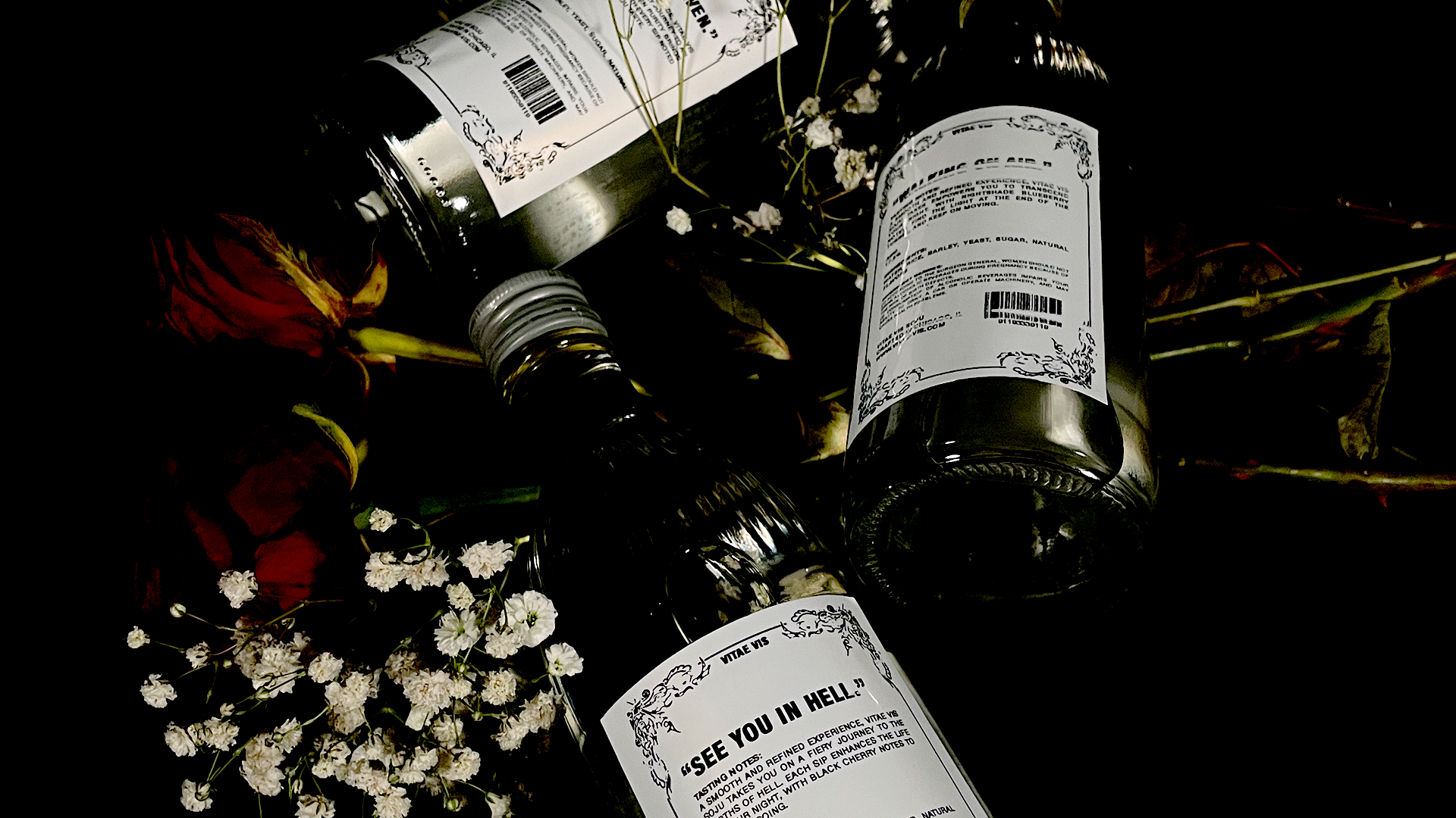
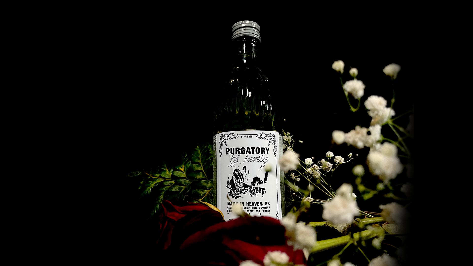
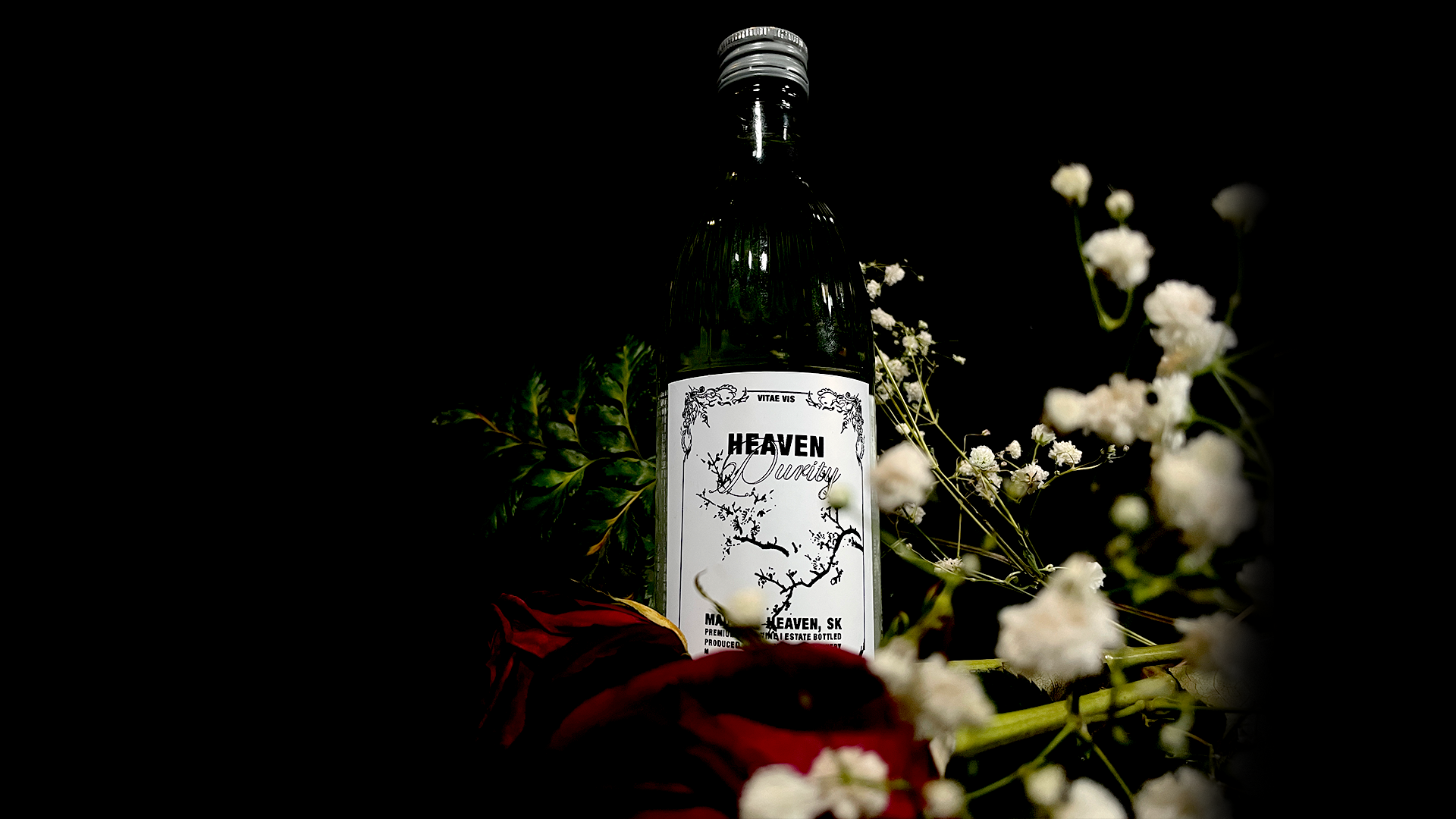
Vitae Vis Soju aimed to break into the competitive spirits market with a unique, multi-tiered product lineup but needed a strong brand identity to differentiate itself. The challenge was to create a premium yet approachable aesthetic that appeals to a wide range of consumers while clearly defining the distinct personalities of each product tier—Heaven, Purgatory, and Hell. Without a cohesive visual language, the brand risked blending into the saturated market instead of standing out.
The Solution
I developed a comprehensive branding strategy for Vitae Vis Soju, focusing on visual storytelling, typography, and packaging design to emphasize the unique character of each tier. Heaven features a refined, elegant design with soft, ethereal elements to reflect its premium quality and high ABV. Purgatory carries a balanced, mysterious aesthetic with sleek typography and subtle intrigue, reinforcing its middle-tier positioning. Hell embraces a bold, fiery design with sharp graphics and intense color contrasts, embodying its affordable, energetic appeal. Each element, from logo design to packaging and promotional materials, was carefully crafted to create a brand identity that feels authentic, modern, and engaging. The visual hierarchy ensures easy recognition of each tier while maintaining a cohesive brand presence.
The Result
The new branding positioned Vitae Vis Soju as a standout player in the soju market, instantly recognizable and appealing to different consumer segments. The distinct yet cohesive visual identity created strong shelf presence and brand recall, leading to increased customer interest and engagement. The premium, story-driven design helped establish Vitae Vis as more than just a beverage—it became an experience that resonated with soju enthusiasts and newcomers alike.


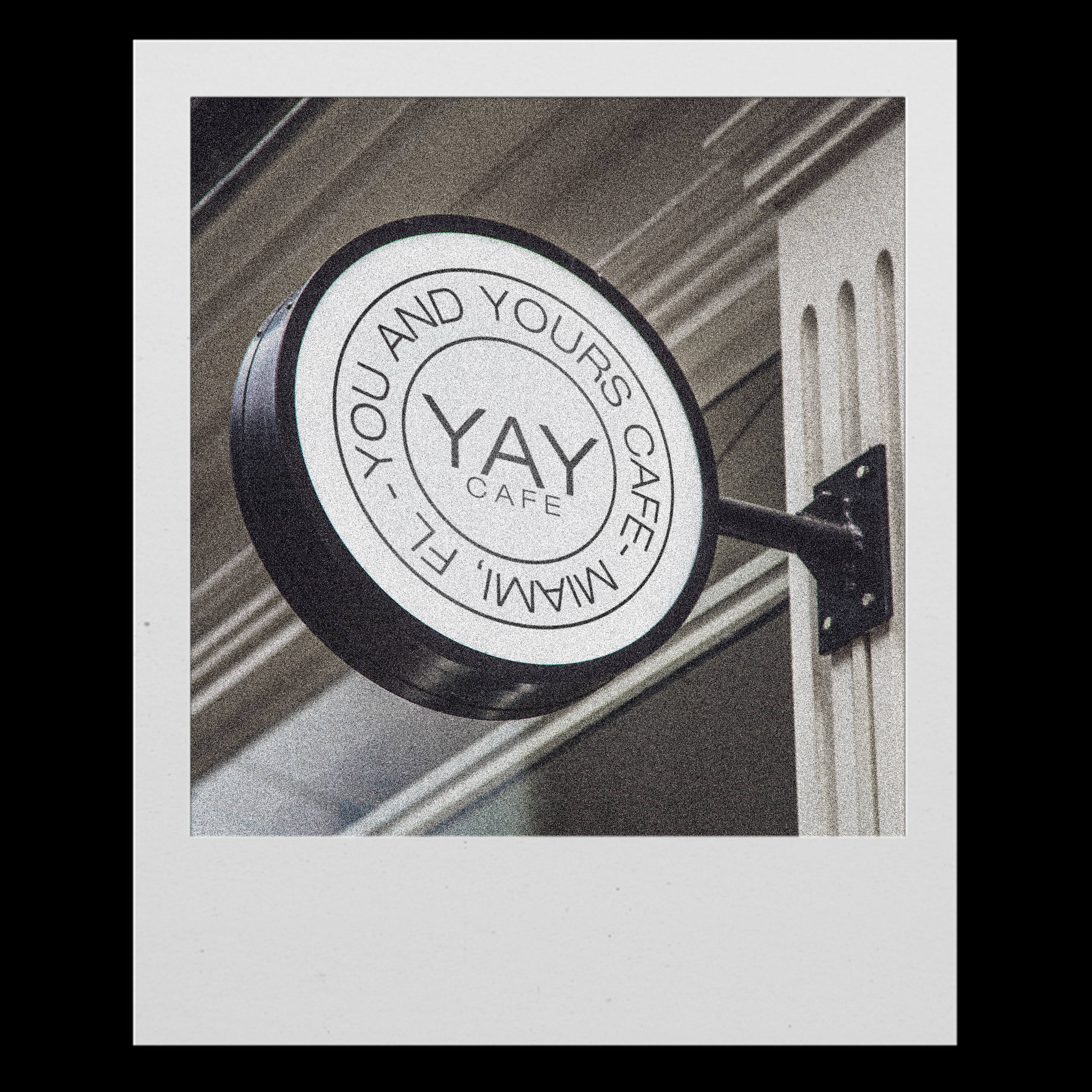
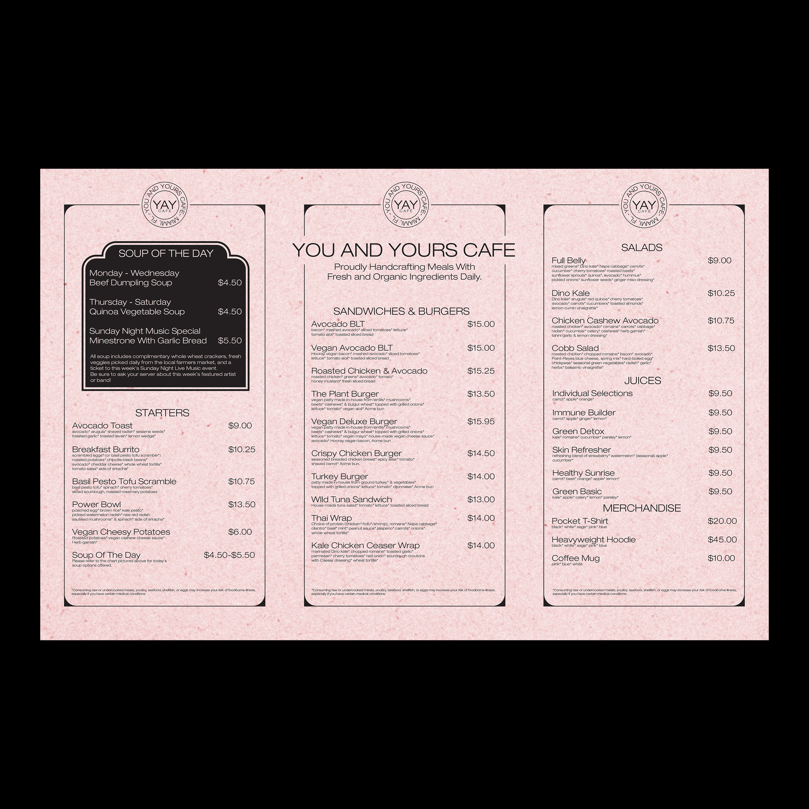
YAY Cafe
Contribution:
Art Direction
Layout Design
Photography
Branding Design
Deliverables:
Signage
Menu’s
Merchandise
Business Cards
Contribution:
Art Direction
Layout Design
Photography
Branding Design
Deliverables:
Signage
Menu’s
Merchandise
Business Cards
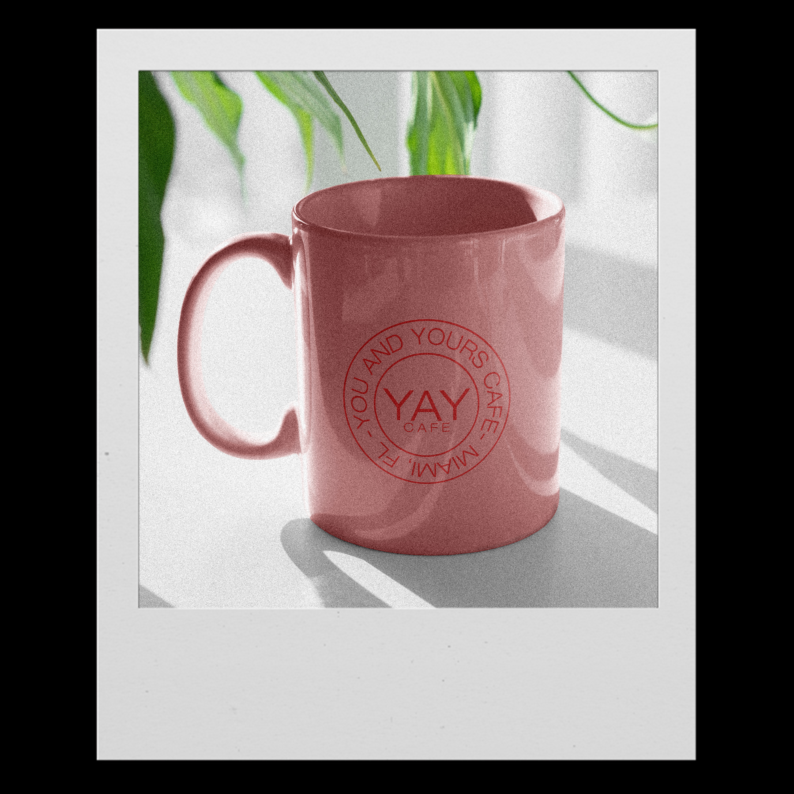
YAY Café, located in the heart of Miami, needed a brand identity that captured the city's vibrant energy while standing out in a crowded café scene. With so many coffee shops competing for attention, the challenge was to create a visual and experiential identity that not only attracted customers but also made them feel immersed in a space that was fun, welcoming, and uniquely Miami. The café needed a design that blended tropical aesthetics with a modern, playful touch, ensuring it became a go-to spot for both locals and tourists.
The Solution
I developed a fresh, eye-catching brand identity for YAY Café that reflects the city's lively atmosphere. The logo was designed to be bold, expressive, and full of personality, incorporating dynamic typography and color combinations that radiate joy and energy. The storefront and interior design were carefully curated to create an inviting yet Instagram-worthy space, featuring vibrant murals, neon accents, and a layout that encourages social interaction. Custom illustrations and graphics were integrated into menus, packaging, and signage, reinforcing the café’s fun and upbeat personality. Every detail, from the playful cup designs to the window displays, was created to make the brand feel like a celebration of Miami’s culture.
The Result
The new branding transformed YAY Café into more than just a coffee shop—it became a destination. The vibrant design and immersive aesthetic attracted a steady stream of customers, increased social media engagement, and positioned the café as a must-visit spot in Miami. With a visual identity that perfectly captures the city's energy, YAY Café now stands out as a place where coffee meets creativity, excitement, and community.

Passion Projects
I’m always exploring new creative avenues through my passion projects—whether it’s branding, illustration, or experimental design. These projects are where I push boundaries, refine my craft, and bring bold ideas to life.
Click here to view
Click here to view